Splitcoaststampers.com - the world's #1 papercrafting community
You're currently viewing Splitcoaststampers as a GUEST. We pride ourselves on being great hosts, but guests have limited access to some of our incredible artwork, our lively forums and other super cool features of the site! You can join our incredible papercrafting community at NO COST. So what are you waiting for?
I"m struggling with "easy," which would be cutting 2 inch squares and handwriting the name and make of each ink color, and "hard," which is keeping up with her system of typing in any new ink color I may happen to get, but it looks so neat and clean. That's my struggle. :0)
Well typing out that thought process was helpful to me! I've decided (and just did it in a few minutes) to make my own squares in a system I know how to do. That way it will be neat AND easy (for me). :0)
Sure 'nuff, Sue! Glad I gave you just the right tweak...again! I love when people appreciate my obsessiveness!
I appreciate your obsessiveness
I reordered my inks according to your lists of colours eight months ago and I like it a lot. I use the SU inks more frequently too as I look thru the 'rainbow' to make a selection.
I'm not sure I understand the need to change the way youstore the cardstock. Maybe I'm just not an artist but I just store mine in the families according to the su charts. Brights, subtles, neutrals, regals and in colors. What is non artistic side missing for the reason for a change? Oh, and I put all the retired stuff in scrapbook containers.
I originally stored my inks and cardstock in the colour families grouping, changing them around as families were altered or colours retired. I decided to stop buying SU inks when they changed over to the foam pads. When I went to regroup what colours I had, the colour caddy looked very patchy. So I decided to rearrange all my colours, current and retired, into ROYGBIV instead.
Since I know I'm not going to buy foam pads I'm not even tempted to look at the new colour offerings. Now my colour collection will remain stable, BUT it won't fit in with any of the new SU! colour charts.
For what it's worth, I don't try to be super exact with order. I have them in general order in neutrals, reds, pinks, oranges, yellows, greens, blue greens, blues and violets. Works for me!
I really like Jennifer McGuire's charts, but I need to add more SU colors, and the entire CTMH line, and I can't get her editable chart to work for me. I'm not very savvy with computers!!!
I use 1/2" x 1 3/4" labels. You can make a sheet and then have it for inks, papers. etc. And you can make whatever color/company you have.
I have also made 2 1/2 x 3 1/2 cards and put a paper punch swatch, stamped image, and maker scribble on each one for each color. Does that make sense? I got that idea here years ago.
__________________ Jac-ee Former FSJ Founding Coach and SU! Demonstrator, now crafting for myself. "There is a fine line between 'HOBBY' and 'MENTAL ILLNESS'"
I really like Jennifer McGuire's charts, but I need to add more SU colors, and the entire CTMH line, and I can't get her editable chart to work for me. I'm not very savvy with computers!!!
Anyone have a link to Jennifer's chart? I've not been able to find it on her blog.
Thank you for the list!! I am taking the plunge this weekend and re-sorting my cardstock. Right now my colors are in color groups but when going through my scraps the other night, it was hard for me to remember what color was in what spot in my drawer. I think I am going to like this way much better
__________________ "For the strength of the Pack is the Wolf, and the strength of the Wolf is the Pack" ~Rudyard Kipling my gallery
Fionna51 help! I am wondering what the skinny is on the green colors. At the top of the list is Mint Melody (Light) then Handsome Hunter (Dark) then Forest Foliage and Glorious Green....then all of the others and then all the way down after the yellows, it goes back to green again. From Luscious Lime to Always Artichoke. At the risk of sounding like a 3 year old who does not know my colors, why is that?
__________________ "For the strength of the Pack is the Wolf, and the strength of the Wolf is the Pack" ~Rudyard Kipling my gallery
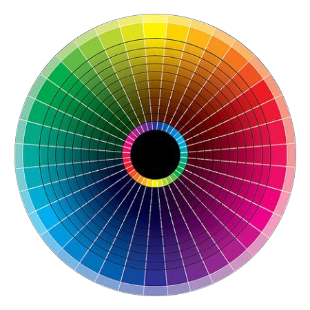
Since a color wheel is a circle, it has to be divided somewhere to put colors in a linear order. That division is totally arbitrary. We usually divide it between red and purple, and we say "ROYGBIV", only because of a rainbow (and, if you get technical, the wavelengths of the light rays involved, which is why the rainbow is the way it is). Arranging papers in color order in a straight line requires separating the circle somewhere...and it's definitely continuous all the way around.
Then you have all the neutral colors. If you map them on a full color chart, they're in the center of a circle as in this example:
So how do you incorporate them into a linear progression of colors? If you look at them, the neutrals in our papers blend naturally into the yellow green part of the color wheel. And with SU colors, True Thyme and River Rock provide a logical transition to the neutrals. Have you ever noticed that if you put these colors next to browns, they look green and if they're next to greens they look brown? :lol: So that was where I chose to "break" the color wheel open...shall we say "open it flat" and provide a connection to the neutrals.
So the break happens between the greens that tend to the blue side and the greens that tend to the yellow side. I started with the blueish ones and ran around the wheel to the yellowish ones and then off to the neutrals.
Well, check THAT out! I did not know. Your explanation was so perfect!! Thanks for taking the time to explain that to me And it is so funny because now that you mention it, when I was arranging everything, I DID question River Rock because it has that greenish tinge to it. Genius.
__________________ "For the strength of the Pack is the Wolf, and the strength of the Wolf is the Pack" ~Rudyard Kipling my gallery
I now know what my first New Year's resolution is - reorganize my SU ink pads and CS. Thanks for finding and bumping this thread!
Well, it's over a year later, and I finally got up the nerve to rearrange my ink pads and CS out of the SU color family groupings and into this order. SO GLAD I DID!!! Trying to figure out where to stick all those retired in-colors was driving me nuts!
And now, since my paper packages are in the color order from my earlier post...
I finally took the plunge and divided up the easy-access working drawers of papers and inks in my cabinet. They're now in rainbow/color wheel sort too. Like you, Pam, the retired colors were driving me nuts...plus, every time they came out with new colors, some were retired and I had to completely re-do my drawer fronts. Yuck! I got so tired of doing that! Now I just add to the end of the row.
So, since I am so CDO (OCD in alphabetical order ;) ) I had to put the new in colors into the listing. Of course, the fact that some of you asked if I had done it yet helped spur me on to get it done!
I got my paper yesterday so here's how I placed the new 2015-2017 in colors...
Handsome Hunter...Sage Shadow�Mint Macaron�Mint Melody
Forest Foliage
Glorious Green
Bermuda Bay...Coastal Cabana...Pool Party
Taken with Teal
Island Indigo...Cool Caribbean
Lost Lagoon
Pacific Point...Tempting Turquoise
Midnight Muse...Not Quite Navy...Blue Bayou...Baja Breeze...Soft Sky
Marina Mist
Buckaroo Blue...Bordering Blue
Bliss Blue...Bashful Blue
Ballet Blue
Brilliant Blue
Brocade Blue
Night of Navy
Concord Crush...Wisteria Wonder...Almost Amethyst
Vintage Violet
Lovely Lilac
Elegant Eggplant...Lavender Lace
Perfect Plum
Eggplant Envy...Orchid Opulence...Pale Plum
Blackberry Bliss...Marvelous Magenta...Mauve Mist
Rich Razzleberry
Baroque Burgundy...Purely Pomegranate...Pink Passion
Melon Mambo...Pixie Pink...Pink Pirouette
Raspberry Ripple...Rose Red...Regal Rose...Pretty in Pink
Bravo Burgundy...Cranberry Crisp...Primrose Petals...Strawberry Slush...Positively Pink
Rose Romance...Blushing Bride
Cherry Cobbler...Real Red
Poppy Parade...Watermelon Wonder�Cameo Coral...Blush Blossom
Rocket Red
Riding Hood Red...Ruby Red...Calypso Coral...Crisp Cantaloupe
Cajun Craze...Dusty Durango
Really Rust
Tangerine Tango...Groovy Guava
Only Orange
Tangelo Twist...Pumpkin Pie...Peach Parfait
Marigold Morning...Apricot Appeal
Summer Sun
More Mustard...So Saffron...Barely Banana
YoYo Yellow
Crushed Curry...Daffodil Delight Delightful Dijon�Hello Honey
Summer Starfruit
Kiwi Kiss
Luscious Lime
Lucky Limeade
Mossy Meadow...Old Olive...Pear Pizzaz...Certainly Celery
Gumball Green
Green Galore...Gable Green Cucumber Crush
Garden Green...Wild Wasabi...Pistachio Pudding
Always Artichoke...Mellow Moss
True Thyme...River Rock (yellow-greenish)
Soft Suede...Baked Brown Sugar (goldish)
Creamy Caramel (orangish)
Chocolate Chip...Close to Cocoa (reddish)
Early Espresso
Crumb Cake Tip Top Taupe�Sahara Sand (taupe)
Going Gray (warm gray)
Basic Black...Basic Gray...Smoky Slate (cool gray)
It was amazing to me how close Watermelon Wonder is to Calypso Coral, just a touch less orange.
And Mint Macaron is really close to Sage Shadow.
Cucumber Crush is its own green! Nothing even close. But a much needed green in the clear, middle greens. Everything else is either strongly blue or strongly yellow.
Delightful Dijon looks wonderful with Hello Honey, and is a much better golden color than More Mustard, which was really orange-y.
Tip Top Taupe is beautiful with Sahara Sand as both are in the taupes range.
Thank you so much for updating this list! I decided yesterday to put all my old SU papers in color order, so of course I came here to find how everyone was doing theirs and I ran across this wonderful thread!THANKS DIANE!!!
__________________ [COLOR=purple]
[FONT=Verdana] [SIZE=5]Donna M.
SPLITCOAST FAN CLUB MEMBER
I am so happy to find this list. I do have a question about the colors listed across, do you just think they are close enough to the same color? I am just now labeling my cardstock that is stored in file folders in drawers. At the same time I'm adding the old in colors into the roygbiv flow. I had them separate but I still use them so it will be nice to have them all together. I'm not sure if SU realizes the confusion the in colors create. First there was retiired/ discontinued colors them a color refresh, and then top all that off with years and years of I colors and all I can say is yikes! What should be easy is no longer. I know I'm late to getting to tweaking my color order but the confusion is finally getting to me. Lol!
Thanks again for a great list. Dina
Dina...If you are talking about my list above, the ones that are in the same rows (for example: Concord Crush...Wisteria Wonder...Almost Amethyst) are ombre type combinations. They are different shades and tints of the same basic color. They are all listed darkest to lightest in their row.
My papers are in order from top of the list down. If I come to a row with more than one color listed, then I put that row in order before moving down to the next row. That way all the coordinating darks/mediums/lights of a particular color are together. So far this is working very well.
I have noticed at times that some new in colors are really close to previous in colors. If that's the case, they are really close to each other in that listing above. Sometimes, though, even though two colors look almost identical (for example, Groovy Guava and Crisp Cantaloupe) the base color was enough different to have them in two different rows (for example, Groovy Guava looks to have just a hint more yellow than Crisp Cantaloupe).
I have been known to change the placement of a color on occasion, though! :oops:
Thank you Fionna51.
That was exactly what I wanted to know. My plan was to put every color current and retired in file folders and label them (roygbiv order) but I ran out of room. The current core colors and in colors, along with the most recent retired colors fit though. I may keep a few file folders with the older retired colors. I'll continue to store the rest in a box in my closet as I have had them. If this idea works out I'll just put a few sheets of each color in those folders, and I'll group all retired of each color range, like all retired shades of blue in one folder and so on. Your list has been very helpful, thank you so much.
Dina
Thank you so much for putting this all together and updating it along with providing the reasons for the colors going across and where you decided on the breaking points for the color "wheel". I am just coming back to stamping after many years. So mostly I only have all the original 4 color family inks and papers along with a few of what was "new" shortly after that. Great place for me to start moving forward.
Hi there Fionna!
We've just got a house to where I will have my own craft room and I have been trying to organize my Stampin' Up supplies in a better way and just came across this post after a search on google. I am so impressed and that you have kept up with it each year.
Out of curiosity have you added the new colors yet for this year? ;-)
Thanks so much for sharing your talent and knack for color theory with us. You have a talent for explaining it well and in layman's terms.
Blessings,
Shawna
Anxiously awaiting the revised list with 2017-2018 In Colors! I've recently revamped my paper storage and now store them according to Fionna's list! It is so pretty and pleasing to the eye! Thank you for providing this list!